Data Storytelling for Business: Bridging the Gap Between Analytics and Action
Learn the art of data storytelling for business. Transform complex analytics into compelling narratives that drive strategic decisions and get stakeholder bu...
- Discover how to transform static reports into dynamic narratives that bridge the gap between technical analytics and strategic business value.
- Understand the biological reasons why the human brain craves stories and how to use this to reduce cognitive load during executive meetings.
- Learn why data storytelling for business requires a foundation of governed data to ensure every insight is backed by a single source of truth.
- Identify a practical framework for drafting a "Big Idea" that summarizes complex insights into one persuasive, action-oriented sentence.
- Explore how to build organizational data literacy by moving storytelling from an individual skill to a core corporate capability.
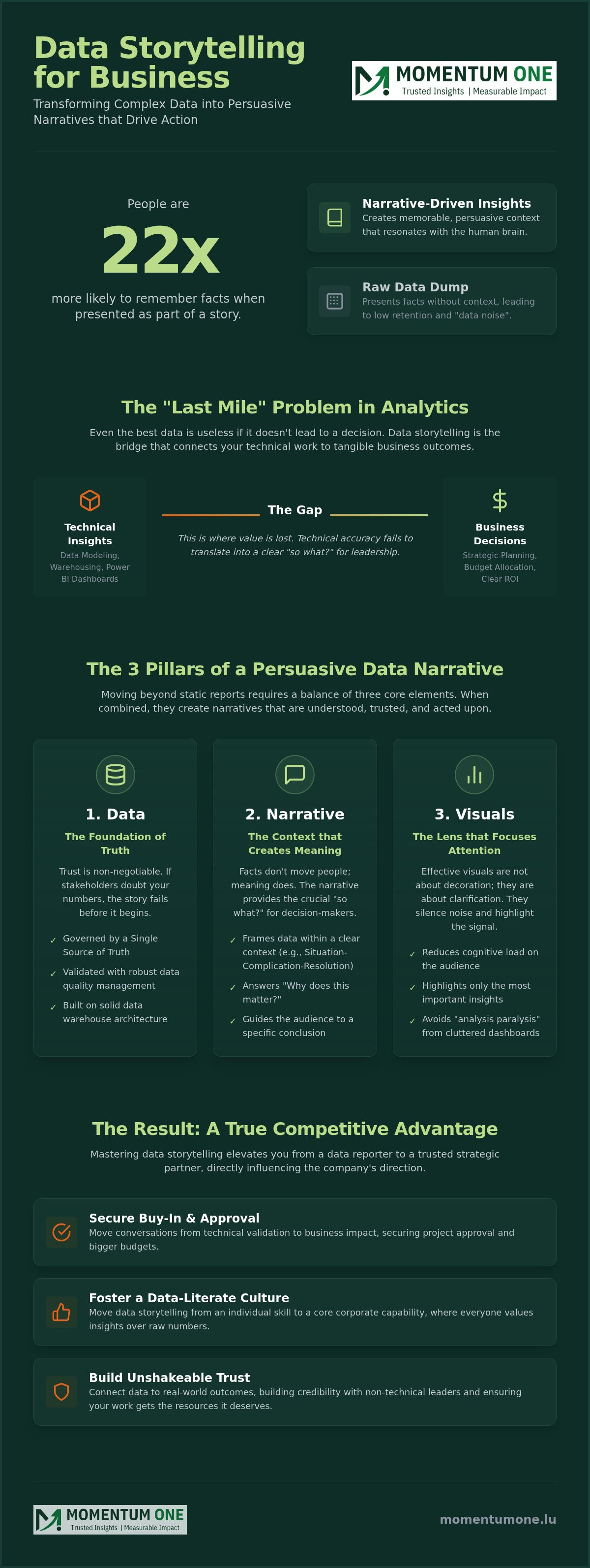
Did you know that people are 22 times more likely to remember facts when they're presented as part of a story? It's a striking reality that explains why even the most sophisticated Power BI dashboards often fail to spark action. You've likely felt the frustration of presenting accurate, real-time data only to be met with blank stares or complaints about "data noise." Mastering data storytelling for business is the essential "last mile" of your analytics strategy. It's the bridge that turns a technical report into a persuasive narrative that drives strategic decision-making.
We understand that your team puts immense effort into data modeling and warehouse design. You deserve to see those technical insights translate into clear ROI and stakeholder buy-in. In this guide, you'll learn how to transform complex datasets into narratives that resonate with non-technical leaders. We'll explore how to move from static charts to interactive stories, helping you reduce the time spent explaining visuals and focus more on driving business value. By the end, you'll have a clear roadmap for fostering a data-literate culture that values insights over raw numbers.
Beyond the Dashboard: Why Data Storytelling is the New Corporate Currency
Many organizations invest heavily in their data infrastructure, yet they still struggle to see a tangible return on that investment. You might have a sophisticated Power BI implementation in place, but if the insights don't lead to action, your data remains a dormant asset. This is where data storytelling for business becomes critical. It's the synthesis of raw data, compelling visuals, and narrative context. While traditional data and information visualization focuses on presenting numbers clearly, storytelling adds the specific context that leaders need to make a move.
We're seeing a fundamental shift from being "data-informed" to being truly "data-driven." Being data-informed just means you have access to the numbers. Being data-driven means those numbers actually dictate your next strategic step. The gap between these two states is often called the "Last Mile" problem. It's the point where technical insights must be communicated to non-technical stakeholders to trigger a decision. Data storytelling is the essential bridge that connects raw analytics to strategic execution.
The Crisis of the 'Cluttered Dashboard'
Executives are often overwhelmed by "data noise." A report filled with twenty different KPIs might seem comprehensive, but it usually leads to analysis paralysis. When a dashboard is too cluttered, the brain struggles to identify what actually matters. Storytelling acts as a filter. It helps you highlight the signal while silencing the noise, ensuring that your audience focuses on the insights that drive growth rather than getting lost in the details. It's about leading the reader to a conclusion, not just dumping information on them.
Data Storytelling as a Competitive Advantage
The Three Pillars of Persuasive Data Narratives
To move beyond simple reporting, you must balance three interconnected elements. When these pillars align, you stop just describing what happened and start explaining why it matters. This structural approach to data storytelling for business ensures that your insights aren't just seen, they're understood and acted upon. It's the difference between a static spreadsheet and a strategic roadmap. By combining technical accuracy with human context, you create a narrative that resonates at every level of the organization.
Data: The Foundation of Truth
Trust is the currency of any narrative. If your audience doubts the accuracy of your numbers, they'll never buy into the story you're telling. Storytelling fails without robust Data Quality Management Services to validate your metrics. Architectural integrity, supported by expert Data Warehouse & Lakehouse Design, ensures a "Single Source of Truth" across the entire organization. This consistency prevents contradictory reports from derailing executive meetings and undermining your credibility. Without this baseline, even the most beautiful chart is just a distraction.
Narrative: The Context that Creates Meaning
Facts don't move people; meaning does. Using frameworks like "Situation-Complication-Resolution" or the "Hero's Journey" helps you effectively communicate insights by framing KPIs as characters with specific goals. Instead of listing a 5% drop in retention as a dry statistic, tell the story of a customer segment facing a new competitive obstacle. This narrative arc provides the essential "so what?" that decision-makers need to justify a change in strategy. It turns a list of facts into a compelling call to action that sticks in the minds of your stakeholders.
Visualisation: The Medium for Rapid Insight
Visuals are the delivery vehicle for your narrative. By applying principles of Gestalt psychology, you can design reports that naturally guide the eye to the most important trends and anomalies. Choosing the right chart for the right purpose is vital. A trend line tells a different story than a comparison bar chart. High-performance, story-ready visuals often rely on expert DAX optimization to keep dashboards responsive and clear under heavy data loads. If you want to strengthen your data foundation, focusing on the synergy between these three pillars is the best place to start. This intersection is where reporting evolves into true business intelligence.
The Science of Decision-Making: Why the Brain Craves Stories
Understanding the biological response to information is what separates a forgettable report from a transformative business event. While we often think of corporate meetings as purely analytical, the human brain isn't a cold processor. It's a narrative engine. Research indicates that data retention improves from a mere 5-10% with statistics alone to approximately 67% when those numbers are combined with storytelling. This isn't just a preference; it's a physiological requirement for effective data storytelling for business. By aligning your presentation with how the brain naturally functions, you ensure your insights aren't just heard, but deeply integrated into the listener's mental model.
When you share a story, something remarkable happens called "neural coupling." This process allows the listener's brain to synchronize with the presenter's, turning a passive observation into a shared experience. It's why storytelling is considered an essential data science skill for any professional looking to influence high-level strategy. This biological connection fosters trust and strategic alignment, making it far easier to secure buy-in for complex projects. Instead of fighting against the brain's natural filters, you're working with them to create a lasting impact.
Reducing Cognitive Friction
The prefrontal cortex, responsible for executive function, has a limited capacity for processing new information. Cluttered dashboards trigger high "cognitive load," which essentially acts as a brain's "off" switch to prevent overload. Effective storytellers use "pre-attentive attributes" like color, size, and orientation to help the brain identify patterns in milliseconds. Simplified visuals act as a cognitive shortcut, allowing the brain to bypass the struggle of interpretation and focus entirely on decision-making. This reduction in friction is vital for keeping an executive audience engaged and focused on the "so what" of your analysis.
From Logic to Emotion (and Back Again)
The idea of the "purely logical" business decision is largely a myth. Neuroscience shows that we use emotion to assign value to different options, while logic provides the justification for our choice. A good data story uses cortisol to create tension around a business problem and dopamine to provide the reward of a solution. You provide the logic through your data, but the story provides the motivation to act. This balance is the key to persuasive communication. If you're looking to bridge this gap in your organization, our Corporate Power BI Training focuses specifically on these psychological principles to help teams drive real action.
Implementing Data Storytelling in the Modern Data Stack
Many professionals view storytelling as a soft skill entirely separate from their technical architecture. In reality, your data stack is the engine that powers your narrative. Effective data storytelling for business requires a structured implementation process that moves from user empathy to technical precision. By following these steps, you can ensure your insights reach their target without getting lost in translation. We've seen that the most successful projects don't just present data; they guide the audience through it.
- Step 1: Define your audience. Identify their primary "Pain Point" before you open any tool. An operations manager cares about different metrics than a CFO.
- Step 2: Draft the "Big Idea." Write a single sentence that summarizes your key insight. If you can't explain it in one sentence, your story isn't clear enough yet.
- Step 3: Select and optimize visuals. Use Power BI best practices to choose charts that emphasize your Big Idea. Avoid "chart junk" that distracts from the message.
- Step 4: Declutter and direct focus. Use preattentive attributes like bold colors or size to highlight the most important data points. This helps the brain process the "so what" in milliseconds.
- Step 5: Contextualize the data. Within a Microsoft Fabric environment, you can pull from a unified data lake to ensure your story is backed by every department's reality.
Leveraging Power BI for Narrative Flow
Storytelling with Microsoft Fabric
Microsoft Fabric changes the game by providing a "single source of truth" through OneLake. This architectural consistency ensures that your story doesn't change when you move from marketing data to financial forecasts. Real-time storytelling is also becoming a reality, allowing businesses to drive immediate pivots based on live data streams. For teams looking to master these technical capabilities, our Microsoft Fabric Training for Developers provides the deep-dive knowledge needed for full enablement. If you're ready to transform your reporting into a strategic asset, check out our Training Solutions to empower your entire workforce.
Cultivating a Narrative Culture: Governance and Literacy
For a narrative to hold weight, it must be built on a foundation of trust. This is why data storytelling for business must evolve from a solo skill into a core organizational capability. Without a shared language and clear "Storytelling Governance," individual narratives can inadvertently distort facts or cherry-pick data to fit a specific agenda. We focus on ensuring that every story told within your company is accurate, reproducible, and aligned with your single source of truth. When stories are governed, they become reliable tools for strategy rather than subjective interpretations.
Measuring the success of these efforts goes beyond looking at chart aesthetics. You should track decision-speed metrics and BI adoption rates to see if your narratives are hitting the mark. When stakeholders understand the story, they spend less time questioning the validity of the data and more time discussing the actual strategy. Our Corporate Power BI Training is designed to facilitate this exact shift, moving teams away from passive reporting toward active, narrative-driven analysis that drives clear business results.
The Prerequisite: Data Literacy
Data literacy is the ability to read, work with, analyze, and argue with data. In a modern corporate context, it's the baseline for any successful AI or BI initiative. You can identify gaps in your team by observing how often technical insights are misinterpreted or ignored in high-stakes meetings. Integrating storytelling into Technical Microsoft Fabric Training ensures that your developers don't just build pipelines; they build the context necessary for business impact. It's about empowering every employee to speak the language of data with confidence and clarity.
The Momentum One Approach to Data Impact
We help our clients transition from simply delivering reports to providing genuine insights. Our Managed Services play a vital role here, maintaining a "Story-Ready" data environment where data quality is never in question. We don't just hand over a dashboard; we partner with you to audit your current reporting culture and identify where complexity is hiding the truth. The next step in your journey is a structured assessment of how your data flows from the warehouse to the boardroom. We're here to ensure your data doesn't just sit in a lakehouse but actually moves your business forward through clear, persuasive communication.
Transforming Your Data into Strategic Impact
The journey from raw data to decisive action requires more than just high-end tools; it requires a narrative that resonates. You've seen how reducing cognitive load and fostering neural coupling can turn a standard meeting into a strategic breakthrough. By grounding your narratives in a single source of truth and prioritizing architectural integrity, you ensure that every insight is met with trust rather than skepticism. Mastering data storytelling for business is the final step in unlocking the true value of your Microsoft Fabric and Power BI investments.
As a Certified Microsoft Solutions Partner with over 8 years of enterprise data experience, we specialize in Fabric and Power BI governance that supports high-performance reporting. We're dedicated to helping you bridge the technical gap and build a culture where data speaks clearly to every stakeholder. It's time to move beyond static dashboards and start driving real business growth through persuasive communication. We're here to provide the steady hand you need in this complex field.
Empower your team with Corporate Power BI & Data Storytelling Training and take the first step toward a more data-literate future. We're ready to partner with you on this journey and help your organization thrive.
Frequently Asked Questions
The Crisis of the 'Cluttered Dashboard'
Executives are often overwhelmed by "data noise." A report filled with twenty different KPIs might seem comprehensive, but it usually leads to analysis paralysis. When a dashboard is too cluttered, the brain struggles to identify what actually matters. Storytelling acts as a filter. It helps you highlight the signal while silencing the noise, ensuring that your audience focuses on the insights that drive growth rather than getting lost in the details. It's about leading the reader to a conclusion, not just dumping information on them.
Data Storytelling as a Competitive Advantage
In the 2026 business environment, where AI-powered analytics are becoming standard, the ability to interpret and explain data is a rare competitive edge. It's no longer enough to answer "What happened?" Stakeholders want to know "Why does this matter and what do we do next?" Mastering this narrative approach is often the deciding factor in securing project approval or a larger budget. It moves the conversation from technical validation to business impact, positioning you as a strategist rather than just a reporter. By connecting data to real-world outcomes, you build trust and ensure your projects receive the resources they deserve. To move beyond simple reporting, you must balance three interconnected elements. When these pillars align, you stop just describing what happened and start explaining why it matters. This structural approach to data storytelling for business ensures that your insights aren't just seen, they're understood and acted upon. It's the difference between a static spreadsheet and a strategic roadmap. By combining technical accuracy with human context, you create a narrative that resonates at every level of the organization.
Data: The Foundation of Truth
Trust is the currency of any narrative. If your audience doubts the accuracy of your numbers, they'll never buy into the story you're telling. Storytelling fails without robust Data Quality Management Services to validate your metrics. Architectural integrity, supported by expert Data Warehouse & Lakehouse Design, ensures a "Single Source of Truth" across the entire organization. This consistency prevents contradictory reports from derailing executive meetings and undermining your credibility. Without this baseline, even the most beautiful chart is just a distraction.
Narrative: The Context that Creates Meaning
Facts don't move people; meaning does. Using frameworks like "Situation-Complication-Resolution" or the "Hero's Journey" helps you effectively communicate insights by framing KPIs as characters with specific goals. Instead of listing a 5% drop in retention as a dry statistic, tell the story of a customer segment facing a new competitive obstacle. This narrative arc provides the essential "so what?" that decision-makers need to justify a change in strategy. It turns a list of facts into a compelling call to action that sticks in the minds of your stakeholders.
Visualisation: The Medium for Rapid Insight
Visuals are the delivery vehicle for your narrative. By applying principles of Gestalt psychology, you can design reports that naturally guide the eye to the most important trends and anomalies. Choosing the right chart for the right purpose is vital. A trend line tells a different story than a comparison bar chart. High-performance, story-ready visuals often rely on expert DAX optimization to keep dashboards responsive and clear under heavy data loads. If you want to strengthen your data foundation, focusing on the synergy between these three pillars is the best place to start. This intersection is where reporting evolves into true business intelligence. Understanding the biological response to information is what separates a forgettable report from a transformative business event. While we often think of corporate meetings as purely analytical, the human brain isn't a cold processor. It's a narrative engine. Research indicates that data retention improves from a mere 5-10% with statistics alone to approximately 67% when those numbers are combined with storytelling. This isn't just a preference; it's a physiological requirement for effective data storytelling for business. By aligning your presentation with how the brain naturally functions, you ensure your insights aren't just heard, but deeply integrated into the listener's mental model. When you share a story, something remarkable happens called "neural coupling." This process allows the listener's brain to synchronize with the presenter's, turning a passive observation into a shared experience. It's why storytelling is considered an essential data science skill for any professional looking to influence high-level strategy. This biological connection fosters trust and strategic alignment, making it far easier to secure buy-in for complex projects. Instead of fighting against the brain's natural filters, you're working with them to create a lasting impact.
Reducing Cognitive Friction
The prefrontal cortex, responsible for executive function, has a limited capacity for processing new information. Cluttered dashboards trigger high "cognitive load," which essentially acts as a brain's "off" switch to prevent overload. Effective storytellers use "pre-attentive attributes" like color, size, and orientation to help the brain identify patterns in milliseconds. Simplified visuals act as a cognitive shortcut, allowing the brain to bypass the struggle of interpretation and focus entirely on decision-making. This reduction in friction is vital for keeping an executive audience engaged and focused on the "so what" of your analysis.
From Logic to Emotion (and Back Again)
The idea of the "purely logical" business decision is largely a myth. Neuroscience shows that we use emotion to assign value to different options, while logic provides the justification for our choice. A good data story uses cortisol to create tension around a business problem and dopamine to provide the reward of a solution. You provide the logic through your data, but the story provides the motivation to act. This balance is the key to persuasive communication. If you're looking to bridge this gap in your organization, our Corporate Power BI Training focuses specifically on these psychological principles to help teams drive real action. Many professionals view storytelling as a soft skill entirely separate from their technical architecture. In reality, your data stack is the engine that powers your narrative. Effective data storytelling for business requires a structured implementation process that moves from user empathy to technical precision. By following these steps, you can ensure your insights reach their target without getting lost in translation. We've seen that the most successful projects don't just present data; they guide the audience through it.
Leveraging Power BI for Narrative Flow
Modern reporting tools offer more than just static images. You can use Bookmarks and Drill-throughs to create interactive stories that allow stakeholders to explore details without losing the main thread. By the end of 2025, it's projected that 75% of data stories will be automatically generated using augmented intelligence. Features like Smart Narratives already use AI to summarize trends in plain language. This automation allows your team to focus on the strategic "why" rather than the manual "how." Customizing these dashboards for specific personas ensures that everyone from the shop floor to the boardroom sees a story tailored to their needs.
Storytelling with Microsoft Fabric
Microsoft Fabric changes the game by providing a "single source of truth" through OneLake. This architectural consistency ensures that your story doesn't change when you move from marketing data to financial forecasts. Real-time storytelling is also becoming a reality, allowing businesses to drive immediate pivots based on live data streams. For teams looking to master these technical capabilities, our Microsoft Fabric Training for Developers provides the deep-dive knowledge needed for full enablement. If you're ready to transform your reporting into a strategic asset, check out our Training Solutions to empower your entire workforce. For a narrative to hold weight, it must be built on a foundation of trust. This is why data storytelling for business must evolve from a solo skill into a core organizational capability. Without a shared language and clear "Storytelling Governance," individual narratives can inadvertently distort facts or cherry-pick data to fit a specific agenda. We focus on ensuring that every story told within your company is accurate, reproducible, and aligned with your single source of truth. When stories are governed, they become reliable tools for strategy rather than subjective interpretations. Measuring the success of these efforts goes beyond looking at chart aesthetics. You should track decision-speed metrics and BI adoption rates to see if your narratives are hitting the mark. When stakeholders understand the story, they spend less time questioning the validity of the data and more time discussing the actual strategy. Our Corporate Power BI Training is designed to facilitate this exact shift, moving teams away from passive reporting toward active, narrative-driven analysis that drives clear business results.
The Prerequisite: Data Literacy
Data literacy is the ability to read, work with, analyze, and argue with data. In a modern corporate context, it's the baseline for any successful AI or BI initiative. You can identify gaps in your team by observing how often technical insights are misinterpreted or ignored in high-stakes meetings. Integrating storytelling into Technical Microsoft Fabric Training ensures that your developers don't just build pipelines; they build the context necessary for business impact. It's about empowering every employee to speak the language of data with confidence and clarity.
The Momentum One Approach to Data Impact
We help our clients transition from simply delivering reports to providing genuine insights. Our Managed Services play a vital role here, maintaining a "Story-Ready" data environment where data quality is never in question. We don't just hand over a dashboard; we partner with you to audit your current reporting culture and identify where complexity is hiding the truth. The next step in your journey is a structured assessment of how your data flows from the warehouse to the boardroom. We're here to ensure your data doesn't just sit in a lakehouse but actually moves your business forward through clear, persuasive communication. The journey from raw data to decisive action requires more than just high-end tools; it requires a narrative that resonates. You've seen how reducing cognitive load and fostering neural coupling can turn a standard meeting into a strategic breakthrough. By grounding your narratives in a single source of truth and prioritizing architectural integrity, you ensure that every insight is met with trust rather than skepticism. Mastering data storytelling for business is the final step in unlocking the true value of your Microsoft Fabric and Power BI investments. As a Certified Microsoft Solutions Partner with over 8 years of enterprise data experience, we specialize in Fabric and Power BI governance that supports high-performance reporting. We're dedicated to helping you bridge the technical gap and build a culture where data speaks clearly to every stakeholder. It's time to move beyond static dashboards and start driving real business growth through persuasive communication. We're here to provide the steady hand you need in this complex field. Empower your team with Corporate Power BI & Data Storytelling Training and take the first step toward a more data-literate future. We're ready to partner with you on this journey and help your organization thrive.
What is the difference between data visualization and data storytelling?
Data visualization is the graphic representation of information, while data storytelling is the narrative context that explains why those visuals matter. Think of visualization as the "what" and storytelling as the "so what." While a chart shows a trend, a story explains the business drivers behind that trend and the necessary next steps. It's the difference between seeing a map and having a guided route to a specific destination.
Do I need to be a designer to be good at data storytelling?
You don't need a design degree to be an effective storyteller; you just need to understand how to direct your audience's attention. Good storytelling relies more on logic and empathy than artistic flair. By focusing on pre-attentive attributes like color and size, you can guide an executive's eye to the most critical data point. The goal is clarity and insight, not aesthetic perfection or complex graphic design.
How can I tell a story if the data shows negative results?
Negative results provide the "complication" in a narrative arc, which is essential for driving a meaningful "resolution." Instead of hiding poor performance, use it to highlight a specific business obstacle that needs addressing. A story about a 10% drop in sales is more persuasive when it identifies the root cause and proposes a data-backed pivot. Transparency builds the trust necessary for stakeholders to approve corrective actions.
What are the best tools for data storytelling for business in 2026?
Microsoft Power BI and Microsoft Fabric are the leading platforms for data storytelling for business in 2026 due to their integrated AI and real-time capabilities. These tools allow you to move from static reports to interactive narratives using features like bookmarks and smart narratives. Other options include Tableau and Looker Studio, but the seamless connection between OneLake and Power BI provides a superior "single source of truth" for consistent corporate narratives.
How do I simplify complex technical data for C-suite executives?
Simplify technical data by focusing on the "Big Idea" and removing any metric that doesn't directly support it. Executives need to know the strategic impact, not the technical nuances of your DAX formulas or data flows. Use clear, action-oriented headers and replace technical jargon with business outcomes. If a chart requires more than five seconds to interpret, it's likely too complex for a high-level executive summary.
How long does it take to train a team in data storytelling?
Most teams can grasp the foundational principles of storytelling through a focused two-day workshop, but mastery comes through consistent practice. Building a narrative culture is an ongoing process that involves auditing current reports and refining communication habits. We've seen that teams typically start showing significant improvement in their presentation clarity within three to four weeks of implementing a structured training program and new governance standards.
Can AI (like Copilot) handle data storytelling for me?
AI can automate the generation of summaries and chart descriptions, but it can't replace the human intuition needed for strategic context. Tools like Copilot are excellent for "Smart Narratives" that explain what happened in a dataset. However, the "why" and the "what next" still require a human strategist who understands the specific goals and nuances of the business. Use AI as a high-speed assistant, not a total replacement.
How does data storytelling improve ROI on BI investments?
Storytelling improves ROI by ensuring that your expensive data infrastructure actually leads to strategic decisions. High-end implementations often fail because reports are ignored or misunderstood by leadership. By mastering data storytelling for business, you increase the adoption rate of your BI tools and reduce the time spent on unproductive meetings. This clarity speeds up the decision-making cycle, directly translating technical insights into measurable business growth and efficiency.